
Nice work
Picture Editing
-
Jigsaw
- Posts: 4498
- Joined: 2008-09-15 02:31
Re: Picture Editing
Hey thats my picture 
Nice work
Nice work
http://www.youtube.com/watch?v=8CKjNcSUNt8
"I love the smell of napalm in the morning. You know, one time we had a hill bombed, for 12 hours. When it was all over, I walked up. We didn't find one of 'em, not one stinkin' dink body. The smell, you know that gasoline smell, the whole hill. Smelled like... victory. Someday this war's gonna end... "
"I love the smell of napalm in the morning. You know, one time we had a hill bombed, for 12 hours. When it was all over, I walked up. We didn't find one of 'em, not one stinkin' dink body. The smell, you know that gasoline smell, the whole hill. Smelled like... victory. Someday this war's gonna end... "
-
Smuke
- Posts: 877
- Joined: 2007-09-25 16:21
Re: Picture Editing
Make sure you take the HUD of, sort of spoils it..Gu^n3r wrote:nothing too flash, dont have all my tools at uni as i do at home, maybe i should get back to work >.<
before
after


In-Game Name: SmukeUK
Wild_Bill: Smuke, you are a true ninja!.
Wild_Bill: Smuke, you are a true ninja!.
-
LechHools
- Posts: 132
- Joined: 2009-05-16 22:00
Re: Picture Editing
I was Bored ......

EDIT: Onother One

EDIT: Onother One
Last edited by LechHools on 2009-06-21 16:52, edited 1 time in total.


-
Spoonman293
- Posts: 7
- Joined: 2009-06-21 17:18
Re: Picture Editing
Good info, thanks for posting.
-
Gu^n3r
- Posts: 248
- Joined: 2008-08-15 01:12
Re: Picture Editing
i actually intended them as smoke trails from projectiles lol, guess i got caried away with the RPG ones[R-COM]cyberzomby wrote:Hmmm, I think the lightning is a big much but the color is nicely done! If you can add one who is less obvious it would look better

Translator: "He's not a bad man.."
Soldier: "He's not a bad man? he's got a BOMB strapped to him!"
-
AnimalMother.
- Posts: 2476
- Joined: 2007-02-25 15:38
Re: Picture Editing
Really like what you've done there LechHools, is a good style!
ex |TG-31st|
AnimalMotherUK - YouTube
AnimalMotherUK - YouTube
vistamaster01: "I just dont get people with girl usernames/pics/sigs lol,
for example I thought AnimalMother was a girl ops:"
Arte et Marte
for example I thought AnimalMother was a girl
Arte et Marte
-
cyberzomby
- Posts: 5336
- Joined: 2007-04-03 07:12
Re: Picture Editing
lol! I see what you mean nowGu^n3r wrote:i actually intended them as smoke trails from projectiles lol, guess i got caried away with the RPG ones
-
LechHools
- Posts: 132
- Joined: 2009-05-16 22:00
Re: Picture Editing
thanks manSars99 wrote:Really like what you've done there LechHools, is a good style!
-
[A9]Bard
- Posts: 47
- Joined: 2009-06-09 10:11
Re: Picture Editing
Fun to see the creativity...
___________________________________
Throw your hands up in the air!
-
[A9]Bard
- Posts: 47
- Joined: 2009-06-09 10:11
Re: Picture Editing
Here is my 2 min of editing (didn´t really have the time).. thank you for the pic Dude388.
You do not have the required permissions to view the files attached to this post.
___________________________________
Throw your hands up in the air!
-
TMOproductions
- Posts: 18
- Joined: 2009-01-08 00:51
Re: Picture Editing
I know i dont have a picture to show but i was wondering what you guys think of my signature i made in Adobe Photoshop CS4 and my logo i created in Adobe Illustrator CS4. I have gone to a half a school day class for two years being instructed in the Commercial Arts. Its great. you guys arent half bad yourselfs...
I will be going to the Art Institute Of Pittsburgh for visual effects and animation (major, bachellors degree)
If you dont understand the clouds in the logo or why there turning pixalated (transformation to digital) you can watch my opening sequence to understand:
www.youtube.com/tmoproductionsfilm
THANKS! i would like to know what you think fellow artists?
-
Rissien
- Posts: 2661
- Joined: 2008-11-07 22:40
Re: Picture Editing
Wernt you told to remove the tags before and then you turn around and put them right back in your sig?

MA3-USN Former
クラナド ァフターストーリー
-
[A9]Bard
- Posts: 47
- Joined: 2009-06-09 10:11
Re: Picture Editing
I think the pixelidea is fun and creative inside the imac screen. Your logo is unclear and a little bit hard to read, also to much spacing for my liking. My suggestion is to change the font. Also there is no need to fade out to the grey. I would have kept the image intact.TMOproductions wrote:I know i dont have a picture to show but i was wondering what you guys think of my signature i made in Adobe Photoshop CS4 and my logo i created in Adobe Illustrator CS4. I have gone to a half a school day class for two years being instructed in the Commercial Arts. Its great. you guys arent half bad yourselfs...
I will be going to the Art Institute Of Pittsburgh for visual effects and animation (major, bachellors degree)
If you dont understand the clouds in the logo or why there turning pixalated (transformation to digital) you can watch my opening sequence to understand:
www.youtube.com/tmoproductionsfilm
THANKS! i would like to know what you think fellow artists?
It´s also a matter of opinion and taste...
Edit... don´t think you have copyrights on the logo´s in your sig.
___________________________________
Throw your hands up in the air!
-
Scot
- Posts: 9270
- Joined: 2008-01-20 19:45

-
Jigsaw
- Posts: 4498
- Joined: 2008-09-15 02:31
Re: Picture Editing
Jeez TMO what is it with you, remove the damn tags!
Also copyright? The copyrights for those images belong to Bohemia Interactive, EA Games and Blacksand Studios/Reality Mod Team.
Also copyright? The copyrights for those images belong to Bohemia Interactive, EA Games and Blacksand Studios/Reality Mod Team.
http://www.youtube.com/watch?v=8CKjNcSUNt8
"I love the smell of napalm in the morning. You know, one time we had a hill bombed, for 12 hours. When it was all over, I walked up. We didn't find one of 'em, not one stinkin' dink body. The smell, you know that gasoline smell, the whole hill. Smelled like... victory. Someday this war's gonna end... "
"I love the smell of napalm in the morning. You know, one time we had a hill bombed, for 12 hours. When it was all over, I walked up. We didn't find one of 'em, not one stinkin' dink body. The smell, you know that gasoline smell, the whole hill. Smelled like... victory. Someday this war's gonna end... "
-
Moo
- Posts: 45
- Joined: 2007-03-20 22:38
Re: Picture Editing
*MOO*
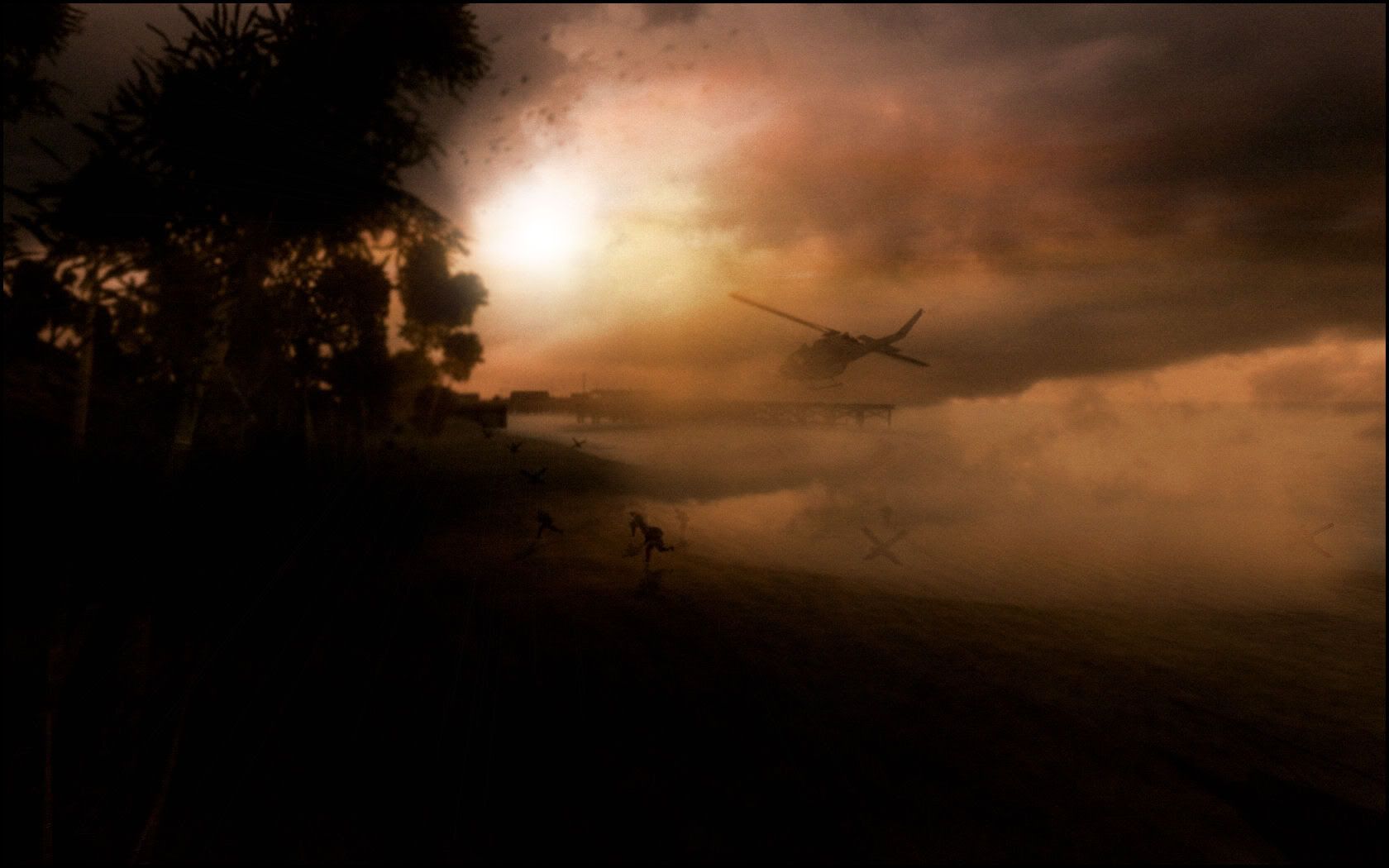
http://img.photobucket.com/albums/0603/ ... ding-1.jpg
And the original courtesy of Sars99
http://screenshot.xfire.com/screenshot/ ... 251d16.png
http://img.photobucket.com/albums/0603/ ... ding-1.jpg
And the original courtesy of Sars99
http://screenshot.xfire.com/screenshot/ ... 251d16.png
Last edited by Moo on 2009-06-25 15:56, edited 1 time in total.

-
Mj Pain
- Posts: 1036
- Joined: 2008-05-07 21:18


-
AnimalMother.
- Posts: 2476
- Joined: 2007-02-25 15:38
Re: Picture Editing
holy ***t moo that is epic!
i've got a replay from TnT Op archer from last night, i'll have some more similar ones soon, got a good one of a AR in a huey so far.
i've got a replay from TnT Op archer from last night, i'll have some more similar ones soon, got a good one of a AR in a huey so far.
ex |TG-31st|
AnimalMotherUK - YouTube
AnimalMotherUK - YouTube
vistamaster01: "I just dont get people with girl usernames/pics/sigs lol,
for example I thought AnimalMother was a girl ops:"
Arte et Marte
for example I thought AnimalMother was a girl
Arte et Marte
-
CareBear
- Posts: 4036
- Joined: 2007-04-19 17:41

-
cyberzomby
- Posts: 5336
- Joined: 2007-04-03 07:12
Re: Picture Editing
Moo is god! Excellent one!
wallpapared for life!
wallpapared for life!