v1.6.5 - ingame HUD & menu changes

Project Reality announcements and development highlights.
Locked
User avatar
Mineral
Retired PR Developer
Posts: 8533
Joined: 2012-01-02 12:37
Location: Belgium

v1.6.5 - ingame HUD & menu changes

Post by Mineral »

Image
With v1.6.5 we did a big update to the ingame HUD and menus. These changes seem to have caused some confusion among players and as such we want to give a more in depth look at what changed.

First off we have the menu changes. These involve changes to the map such as opening it faster, removing the border and making the map in the squad menu opaque. Further we reorganized parts of the menu and updated textures to a more modern design. The original menu still stemmed back from the original Battlefield 2 menu and started to look rather dated. Additionally the reorganization of buttons and adding confirmation dialogues to destructive actions were made to decrease the chance of accidents and make the menus more accessible for new players. As we fix the last issues that slipped into 1.6.5 menus, we are also open for suggestions on how to further improve the menus.

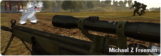
The second and probably bigger change was the introduction of widescreen support for the ingame HUD. Battlefield 2 got created in an age when monitors were ginormous and more importantly the screens were square. As such the entire game did not get designed for modern widescreen monitors. In fact it took DICE 8 years to implement some sort of widescreen support and that only involved the 3d game scene. Further it only added support for 16:9 screens. In 1.6.4 we fixed that and added better support for even wider screens, but the HUD was still left in the ancient state of 2005. These limitations resulted in a HUD designed for 4:3 aspect ratios to be stretched across 16:9 and wider screens. As a result everything became 133% (on 16:9, 175% on 21:9) as wide as it should be. This resulted in circles becoming ovals, squares becoming rectangles, vertical lines becoming thicker than horizontal as well as things becoming more blurry than they should.

Thanks to the findings of Ekiso from the Forgotten Hope 2 team we were finally able to fix this in v1.6.5 and add full support for widescreens into PR. With this fix everything is now just as wide as it should be and the individual pieces of the HUD look as they were always meant to look. We understand that this is a big change for everyone who spent years looking at the old HUD.

Please see the comparisions below to see the clear difference between the old and new. We hope this highlight makes things a little bit more clear, if you have any further feedback or questions please use our feedback forum.

Comparison between old and new


Comparison between old and new


Comparison between old and new


Comparison between old and new
Support Project Reality!

The Project Reality Team develops this modification completely free of charge for its community to download and play. If you would like to show your support, please consider donating to our team. These funds go directly towards website expenses, including bandwidth, hosting, domain registration, and maintenance. We never use donation funds to directly pay team members.
Image

For more information, please feel free to join us on our public forums to discuss this and other news. Also, be sure to connect to Project Reality through social media to stay informed and receive up to the minute updates, the occasional leaked bit of information, and more! See you on the battlefield!

Image Image Image Image Image
- The Project Reality Team
The_Turkish_Moose
Posts: 307
Joined: 2013-03-16 14:40

Re: v1.6.5 - ingame HUD & menu changes

Post by The_Turkish_Moose »

Is it out of the question to update some of the UI elements to be similar sizes to it's old 4:3 stretched version? I'm not saying stretch the actually image again, but I mean, make the compass at the bottom of the screen longer, it's too small now imo. Personally I think the comm. rose looked better more stretched out (excluding the icons - I'm talker about wider boxes and text).

One of my biggest annoyances is with the Commander screen. It's even smaller now with larger black bars. This over everything with the new UI needs addressing. The stretched UI in the commander UAV screen meant I could see more before. Now my view from the UAV is much more limited.

Thanks for addressing the community Mineral about the new UI.
Last edited by The_Turkish_Moose on 2021-04-06 22:45, edited 1 time in total.
Image
Michael Z Freeman
Posts: 240
Joined: 2009-03-27 18:45

Re: v1.6.5 - ingame HUD & menu changes

Post by Michael Z Freeman »

This was one the most needed quality of life improvements and I can't see why it would confuse anyone. I still get confused by some of the in game functions, but never the GUI/HUD.
Image
User avatar
Mats391
PR:BF2 Lead Developer
Posts: 7636
Joined: 2010-08-06 18:06

Re: v1.6.5 - ingame HUD & menu changes

Post by Mats391 »

The_Turkish_Moose wrote:Is it out of the question to update some of the UI elements to be similar sizes to it's old 4:3 stretched version? I'm not saying stretch the actually image again, but I mean, make the compass at the bottom of the screen longer, it's too small now imo. Personally I think the comm. rose looked better more stretched out (excluding the icons - I'm talker about wider boxes and text).
Just to make it clear, the stretched compass showed the same range as the new one. It also was just as accurate. Saying that, we can adjust the size of pretty much everything with only few limitations. Currently buttons do not work in the extended space and things like the squad list have a hardcoded width, but even these are potentially changeable by us, just require more work ;)
Image

Mineral: TIL that Wire-guided missiles actually use wire
robert357
Posts: 227
Joined: 2016-01-29 12:58

Re: v1.6.5 - ingame HUD & menu changes

Post by robert357 »

I also think wider compass was better.
Image
User avatar
Mats391
PR:BF2 Lead Developer
Posts: 7636
Joined: 2010-08-06 18:06

Re: v1.6.5 - ingame HUD & menu changes

Post by Mats391 »

robert357 wrote:I also think wider compass was better.
Can you expand on how it should be wider? We could make it show a wider range or edit the texture to increase spacing between the lines. If we do the later, we would have to adjust width of the compass accordingly to still show same range. That way it would become the same as old stretched version, just hopefully less blurry ;)
Image

Mineral: TIL that Wire-guided missiles actually use wire
robert357
Posts: 227
Joined: 2016-01-29 12:58

Re: v1.6.5 - ingame HUD & menu changes

Post by robert357 »

As long it would looks similar to the old stretched compass I will be happy. If possible it can be combination of both? A little wider range and more spacing between.
Image
The_Turkish_Moose
Posts: 307
Joined: 2013-03-16 14:40

Re: v1.6.5 - ingame HUD & menu changes

Post by The_Turkish_Moose »

Mats391 wrote:Can you expand on how it should be wider? We could make it show a wider range or edit the texture to increase spacing between the lines. If we do the later, we would have to adjust width of the compass accordingly to still show same range. That way it would become the same as old stretched version, just hopefully less blurry ;)
Increased spacing is what I'm talking about. That would be my preference. If it's too much work then I'd rather you focus on more important things.

Can any improvements be made to the Commander screen? The black bars aren't very nice and the I hope the UAV screen becomes larger. The view from the UAV was actually better when stretched.
Image
BlackburnUTG
Posts: 3
Joined: 2018-06-07 20:44

Re: v1.6.5 - ingame HUD & menu changes

Post by BlackburnUTG »

So many times I accidentally switched teams when tried to click on "Squads".
Can those buttons be a little bit further?
LORD-SATAN
Posts: 6
Joined: 2020-10-01 06:54

Re: v1.6.5 - ingame HUD & menu changes

Post by LORD-SATAN »

Opening the map with TAB faster was what we needed, as squad leaders. Thanks!
Last edited by Rhino on 2021-04-09 21:22, edited 1 time in total.
User avatar
Mats391
PR:BF2 Lead Developer
Posts: 7636
Joined: 2010-08-06 18:06

Re: v1.6.5 - ingame HUD & menu changes

Post by Mats391 »

robert357 wrote:As long it would looks similar to the old stretched compass I will be happy. If possible it can be combination of both? A little wider range and more spacing between.
Testing wider compass:
Image
Image

Mineral: TIL that Wire-guided missiles actually use wire
The_Turkish_Moose
Posts: 307
Joined: 2013-03-16 14:40

Re: v1.6.5 - ingame HUD & menu changes

Post by The_Turkish_Moose »

Mats391 wrote:Testing wider compass:
Image
Yeah that looks very nice. The increased spacing makes it easier to read and accurately relay directions to the squad. I feel like this will also stop confusing people who think the camera FOV has changed :lol:
Image
robert357
Posts: 227
Joined: 2016-01-29 12:58

Re: v1.6.5 - ingame HUD & menu changes

Post by robert357 »

Yeah! This looks much better! Very nice.
Image
_Gabo
Posts: 19
Joined: 2020-04-30 03:26

Re: v1.6.5 - ingame HUD & menu changes

Post by _Gabo »

Mats391 wrote:Testing wider compass:
Image
Now that the compass has been resized it would be more pleasant if it were redone because its quality is not very good, it is just a matter of aesthetics.
User avatar
Mats391
PR:BF2 Lead Developer
Posts: 7636
Joined: 2010-08-06 18:06

Re: v1.6.5 - ingame HUD & menu changes

Post by Mats391 »

_Gabo wrote:Now that the compass has been resized it would be more pleasant if it were redone because its quality is not very good, it is just a matter of aesthetics.
Yes, updating textures to be higher resolution (super sampling) would be ideal, but also tons of work. If you are up for it, feel free to start with the compass ;)
Image

Mineral: TIL that Wire-guided missiles actually use wire
Tomasinost
Posts: 14
Joined: 2020-07-16 13:19

Re: v1.6.5 - ingame HUD & menu changes

Post by Tomasinost »

Bring back old hud to actually make pr better.
spacemarine42
Posts: 12
Joined: 2015-01-02 01:46

Re: v1.6.5 - ingame HUD & menu changes

Post by spacemarine42 »

I am 100% on board with the new aspect ratio, it had seriously bugged me for years. Measuring distances is going to be a lot easier now.

That said, I definitely preferred the more complex old textures for HUD elements like the select squad menu, which had beveling/borders/shadows, as opposed to the current textures which are completely smooth. The new HUD textures seem to have lost some of the special character that PR has. If it's possible to change the old HUD elements like the "switch team" and "squad"/"kit" buttons back to correct-aspect-ratio versions of the old textures, then that would be great!
Locked

Return to “Announcements & Highlights”